Otter, Stay Sharp, Stay Safe
Facing low blood sugar alone can be intimidating and stressful. My thoughts become increasingly foggy as my numbers drop, creating more and more panic as I try to take care of myself. Otter was created as a school project to calm its user and assist them in making the right call for their health.
I worked as the UX and UI designer for this project, compiling research to better define the problem and possible solutions, as well as fine-tuning the brand identity and creating visual assets to mirror both company and user goals.
Research
I surveyed nine type one diabetics to determine what challenges were commonly faced during low blood glucose, as well as ways to improve current solutions. I would have preferred to conduct surveys in person to compensate for attitudinal biases but was unable to meet with diabetics during my timeframe for research. I ended the survey with two multiple choice questions to gather additional data to combat this.
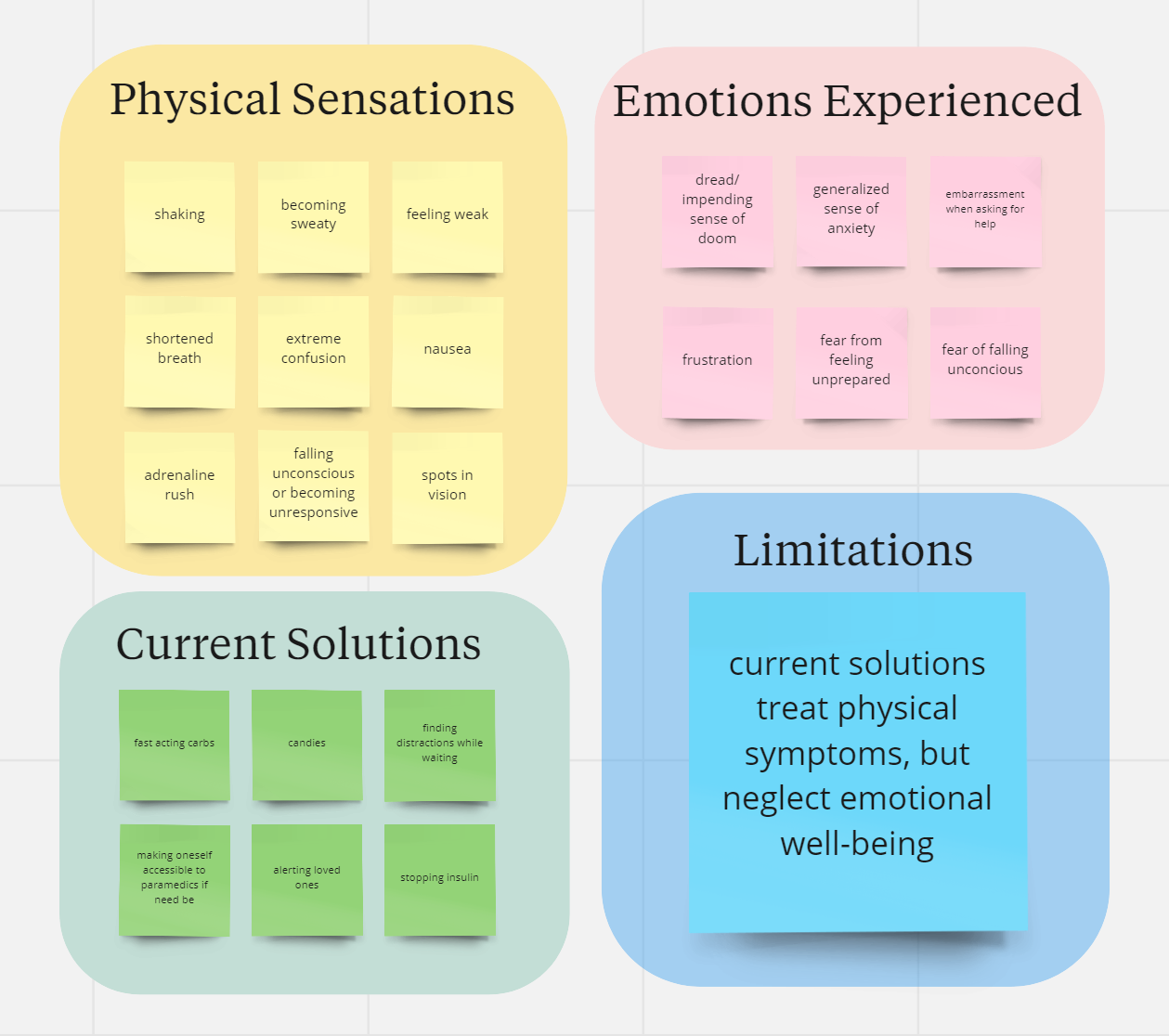
Examining this information, I developed my empathy map by organizing my responses with key phrases to identify common concerns and evaluate current user solutions based on need
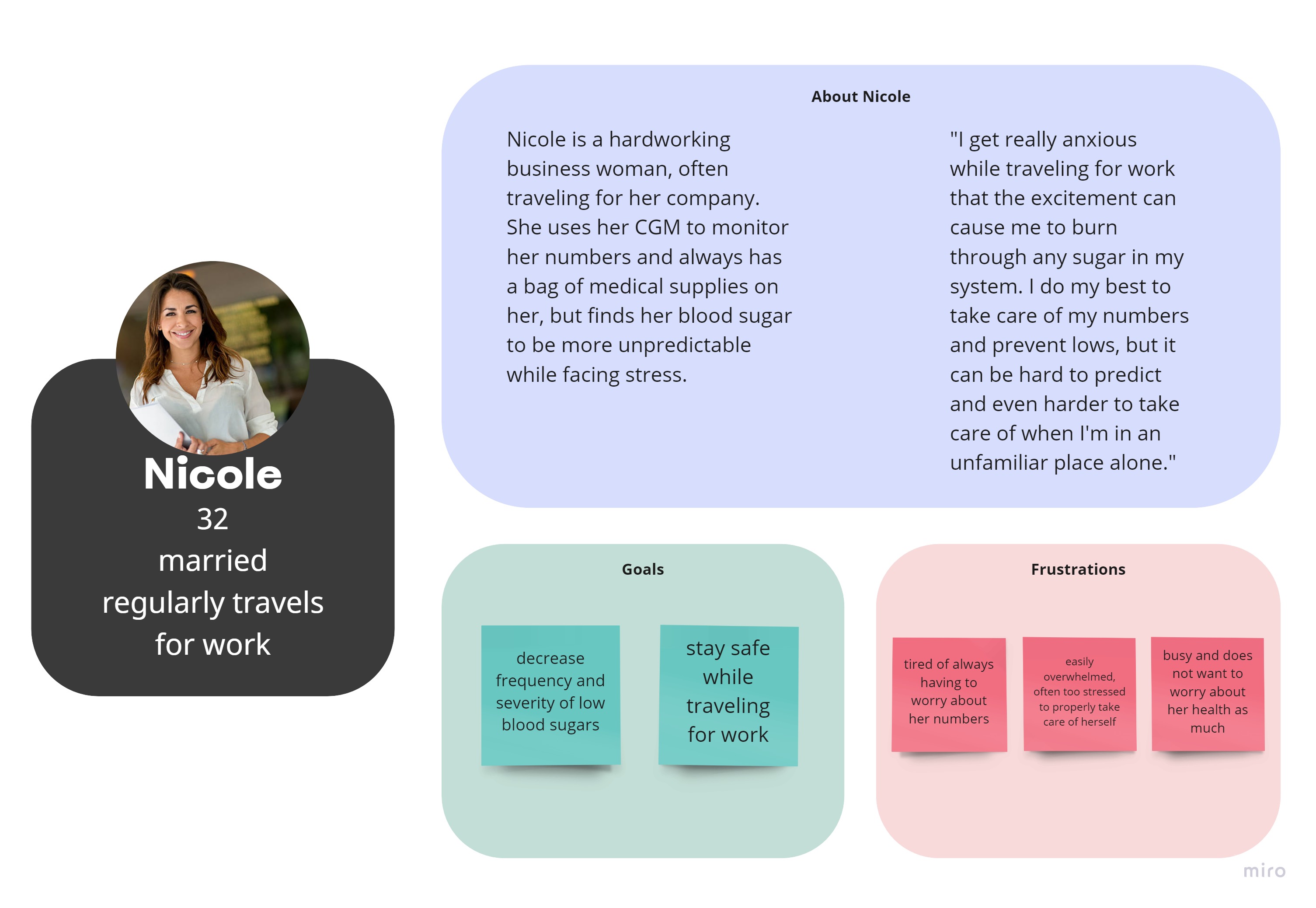
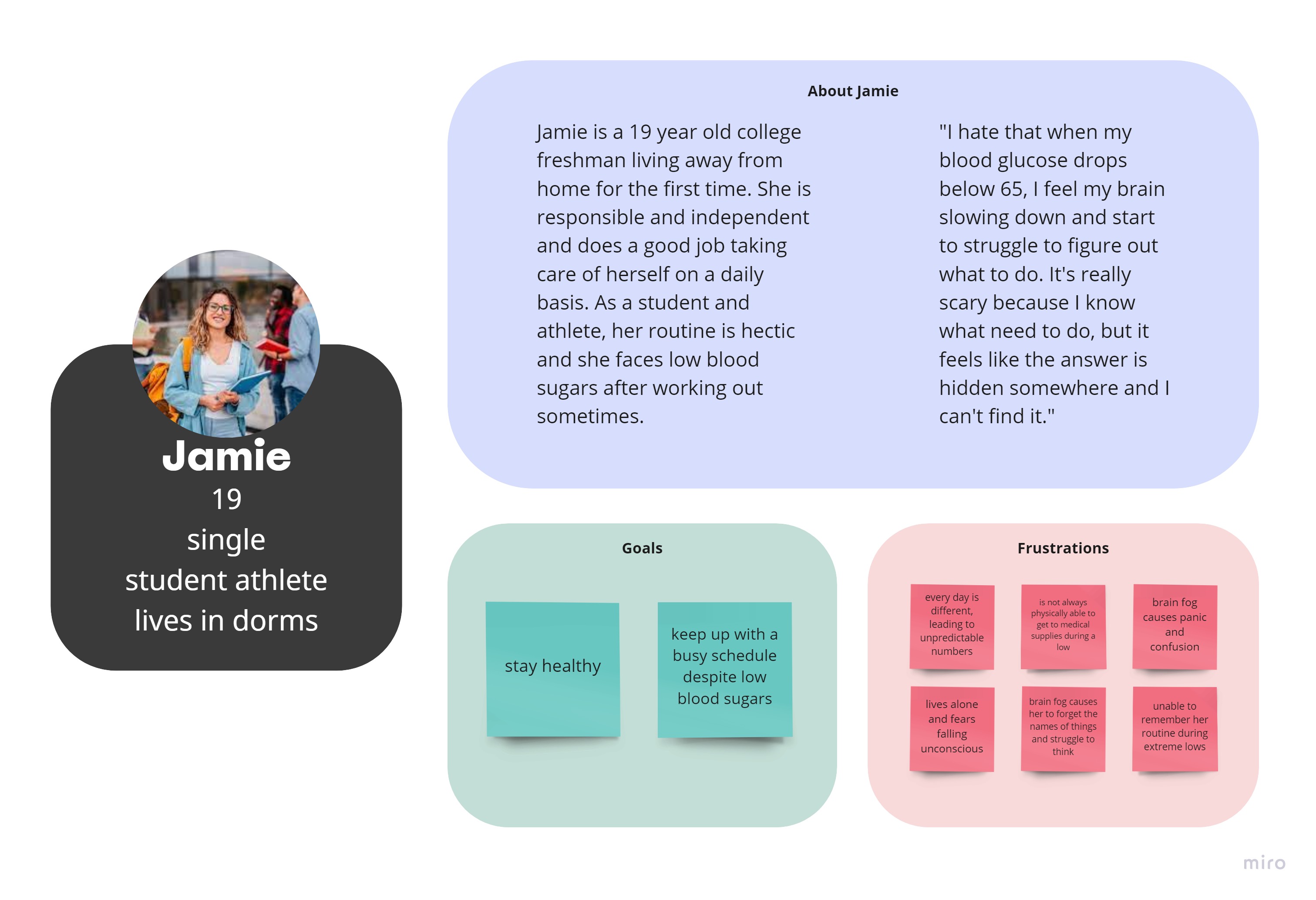
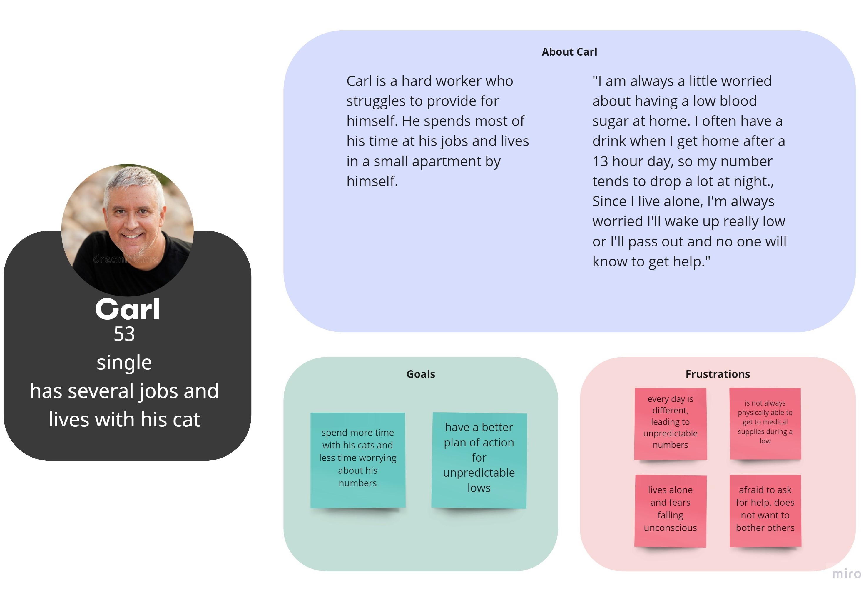
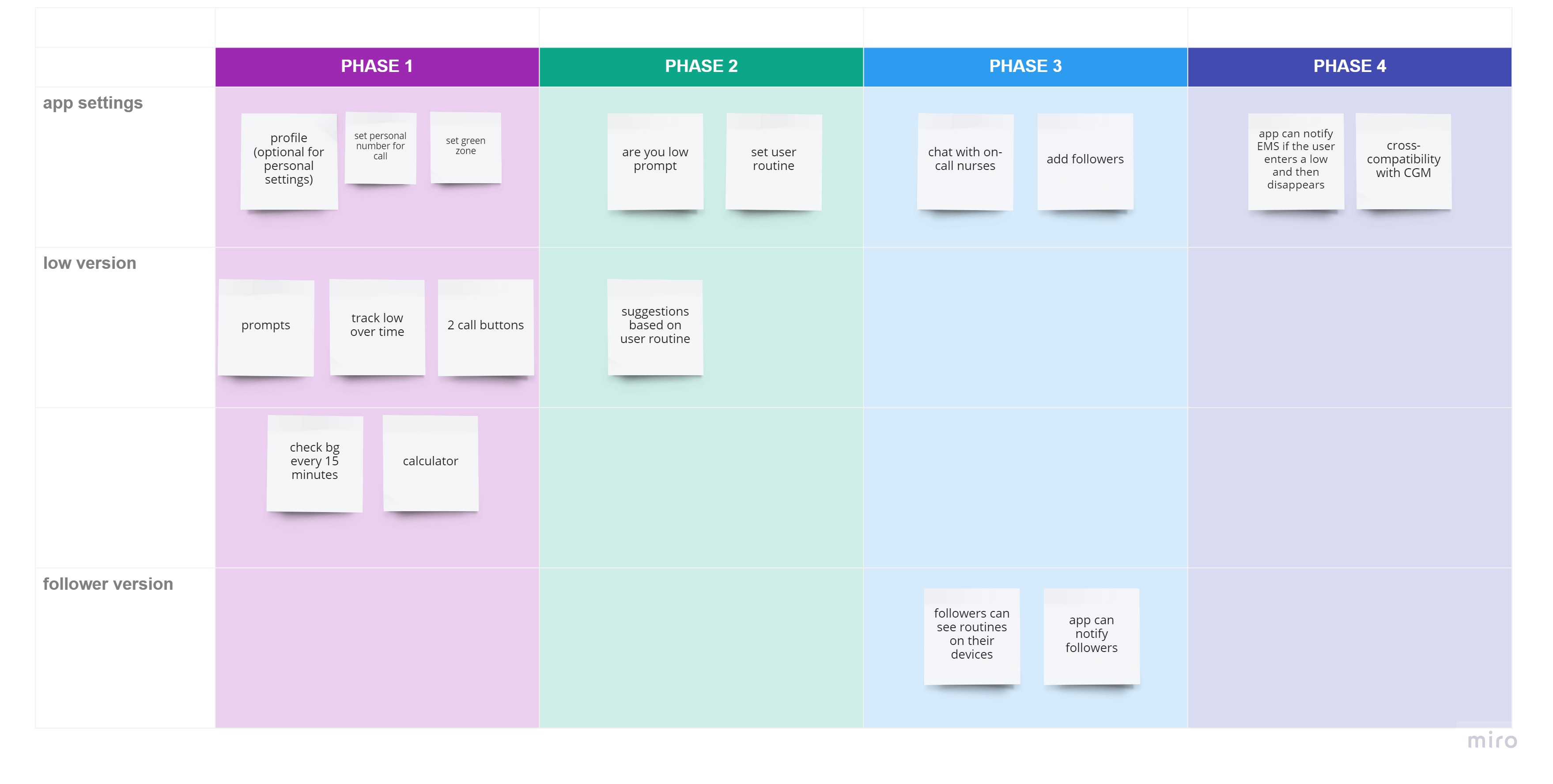
I then developed three user personas to determine my MVP based on their overlapping goals and frustrations.
During this time, I also did some work on the branding of the program, as this is an independent project that I plan to release to the app store at a later date. The app’s goal is to comfort and guide the user, so I selected a color scheme and art style that mirrored the emotion I want to evoke within the user.
Protoyping
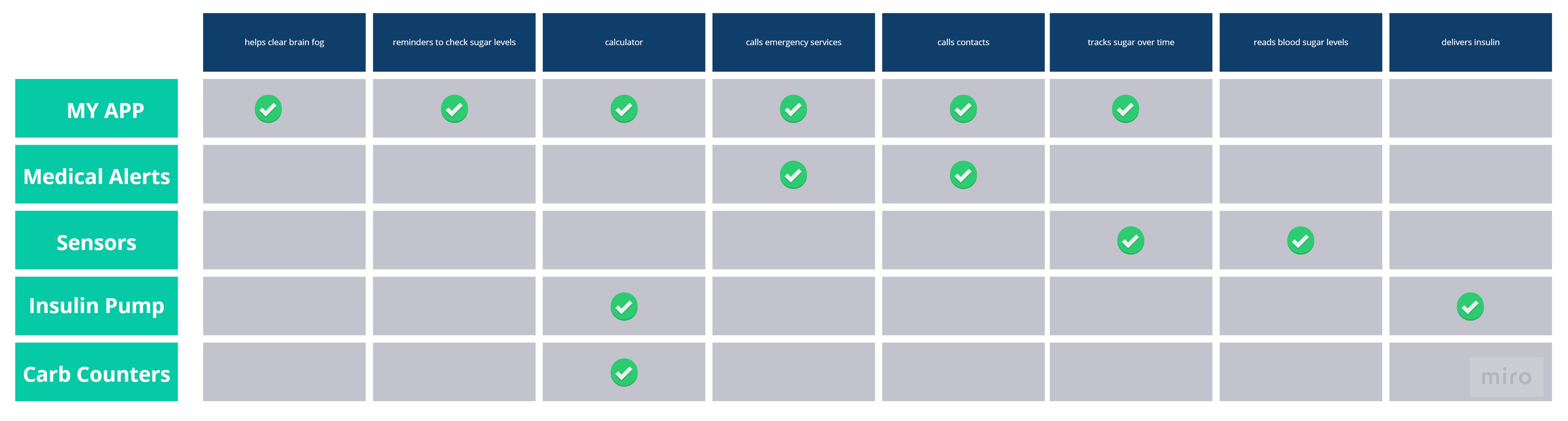
Afterwards, I examined my MVP alongside my competitor’s analysis to ensure I was on the right path before I began prototyping.
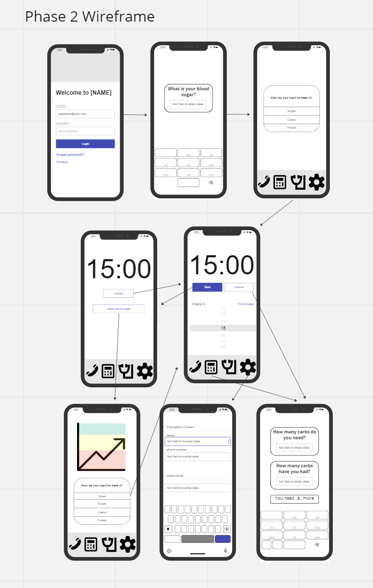
Next, I created a set of wireframes to be tested against the user's intuition with the goal of fine-tuning the flow of the program before prototyping.
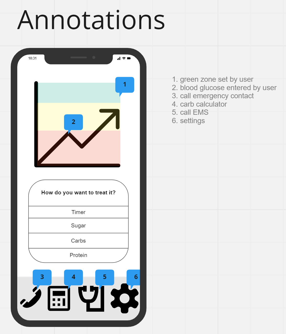
During the testing phase, I decided to delay having the user create an account, as most features would not require this information from the user, allowing them to understand the benefit of my app before they provide personal information. Not only does this encourage the user to want to sign up to access additional features, but it also increases the application's accessibility during a time of distress. Not only this, but I also made sure to use clearer icons and change the order of the bottom controls to make the prototype more user-friendly.
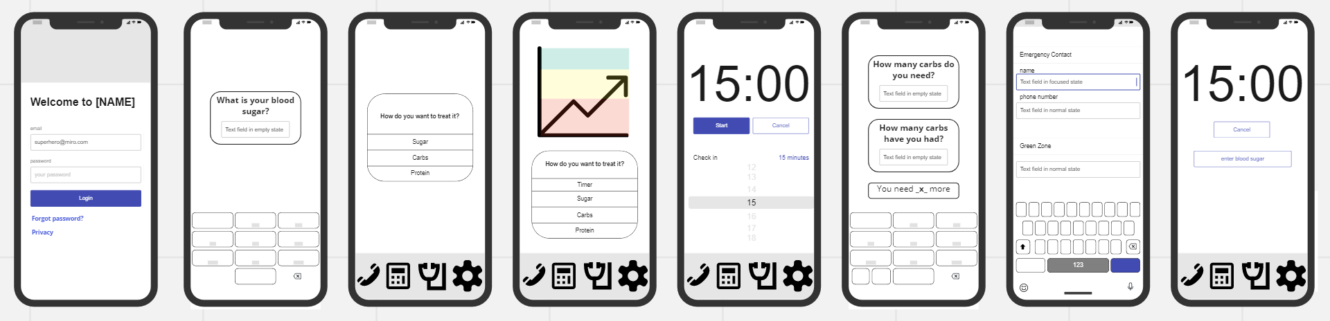
I then moved into Adobe XD to create
this prototype
that will undergo more user testing before being exported as code for a developer to make into a fully functional app.